When people hear the word accessibility, they often think it’s only about meeting compliance requirements or supporting a small group of users. In reality, accessibility is about designing content that works better for everyone, across different contexts, abilities, and situations.
Think about someone with an injured wrist relying on keyboard shortcuts because they can’t use a mouse, busy professionals listening to content via screen readers while completing other hands-on tasks, or a learner trying to focus in a noisy environment. Accessible design supports all of these scenarios and often improves usability overall. Plus, it’s always valuable to have options in how to engage with course content.
In this post, we’ll briefly look at what accessibility means in a digital context and then walk through 10 simple, practical ways you can make your content more accessible straight away. Even small, thoughtful design choices can make a big difference!
A Quick Overview of WCAG
The Web Content Accessibility Guidelines (WCAG) are developed by the World Wide Web Consortium (W3C) as part of the Web Accessibility Initiative (WAI). WCAG provides internationally recognised guidance for making web content more accessible to people with disabilities.
WCAG is built around four key principles. Content should be:
- Perceivable – users can perceive the information being presented
- Operable – users can navigate and interact with the content
- Understandable – content and interfaces are clear and predictable
Robust – content works with a wide range of assistive technologiesLorem ipsum dolor sit amet, consectetur adipiscing elit. Ut elit tellus, luctus nec ullamcorper mattis, pulvinar dapibus leo.
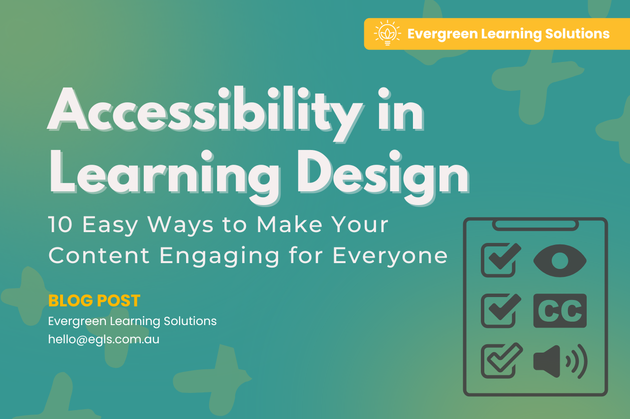
10 Easy Ways to Make Your Content More Accessible
1. Use Text Styles to Organise Content Meaningfully
Headings aren’t just about visual appearance, they provide structure for screen readers and assistive technologies. Always use built-in heading styles (H1, H2, H3, etc.) rather than manually bolding or enlarging text. A clear heading hierarchy helps users scan content quickly and understand how information is organised.
2. Keep Content Structure Predictable and Logical
Consistency matters. Use the same layout patterns across pages, keep navigation in familiar places, and present information in a logical order. Predictable structure reduces cognitive load and helps users, especially those using screen readers or keyboard navigation to move through content efficiently.
3. Use Alternative Text for Images
Alternative (alt) text allows screen readers to describe images to users who can’t see them. Good alt text explains the purpose of the image, not just what it looks like. If an image is purely decorative, mark it as such so it’s skipped by assistive technologies.
4. Provide Captions and Transcripts for Audio and Video
Captions and transcripts aren’t only for people who are Deaf or hard of hearing. They support comprehension in noisy environments, benefit additional language learners, and allow users to review content quickly. As a bonus, transcripts also improve searchability.
5. Use Descriptive Link Text
Avoid links like “click here” or “read more”. Screen reader users often navigate by scanning links, so each link should make sense on its own. Instead, use descriptive text such as “Download the accessibility checklist” or “Read the full WCAG overview”.
6. Choose Accessible Document Formats
When sharing resources, consider how accessible the document format is. Documents created in tools such as Word or Canva can be converted into accessible PDFs when best practices are followed. This includes using Optical Character Recognition (OCR), tagging PDFs to define the structure of the document, and ensuring headings, lists, and reading order are correctly set. Where possible, provide documents in multiple formats (such as both PDF and Word) to give users flexibility in how they access and interact with the content.
7. Use Colour Meaningfully (and Carefully)
Colour should never be the only way information is conveyed. For example, don’t rely on red text alone to signal an error, pair it with icons or text labels. Also ensure there is sufficient contrast between text and background colours so content remains readable for users with low vision or colour blindness.
8. Ensure Content Can Be Used with a Keyboard
Some users cannot use a mouse due to injury, disability, or assistive technology preferences. Make sure interactive elements can be accessed using keyboard controls such as Tab, Enter, and arrow keys. This is a core accessibility requirement that also improves usability for power users.
9. Write in Clear, Plain Language
Accessibility includes cognitive accessibility. Use clear, concise language, short paragraphs, and plain English where possible. This supports users with cognitive disabilities, people reading in a second language, and anyone skimming content under time pressure.
10. Test Your Content in Different Contexts
Try navigating your content using only a keyboard, zooming text to 200%, or listening to it with a screen reader. You don’t need to be an expert, even basic testing can highlight barriers you may not have noticed.
Final Thoughts
Accessibility isn’t a trend or a checkbox; it’s just good design! When content is built that is flexible, clear, and usable in different situations, a better learning experiences is created for everyone.
Start small, keep improving, and remember: if your content is more accessible, it’s almost always more effective too!